
Branding, Signage, Logo Design: The Little Peacock, South Liverpool
- Mar 3
- 1 min read
This was an interesting brief and an exercise in helping write the brief with the client. A new and exciting space was opening locally, and they would be catering to parents and their toddlers during the day, with a view to later develop the kitchen into a take-away and cool performance venue.
Read on, my friend, and I'll take you through the process and show you some of the alternative logos I created.

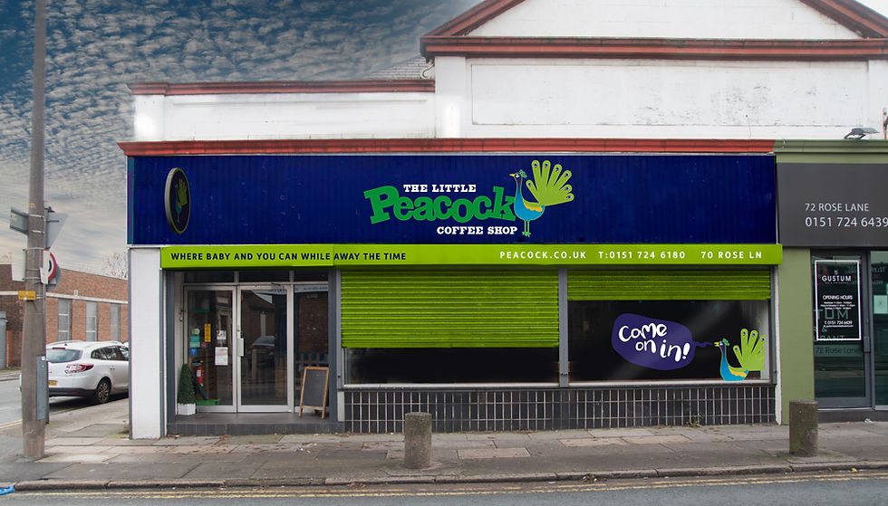
We decided that a friendly character design approach would be great to draw in parents and their toddlers. I used the influence of hundreds of 1950s and 60s cartoons that I loved at a tender age and created the proud fowl. This style was interestingly introduced into staples like Tom and Jerry by artists like Chuck Jones. My peacock was influenced more by the other characters and the 'set designs' of the shows.


I created a website using Wix that showcases the offerings day and night. The site included a built-in ordering feature that worked to great effect. The burgers were absolutely delicious.
Wherever The Little Peacock character could, he'd add a little sass - the cheek!


Here is a look at some of the alternatives. I particularly loved the strong line work icon, but we felt this had the wrong vibe overall.

The shop front.


Comments